Designing TomTom Roadtrips
A team was assembled to design and build a new TomTom app, with a focus on road trips, with the goal of providing the best scenic routes and inspiration to its users.
MY ROLE
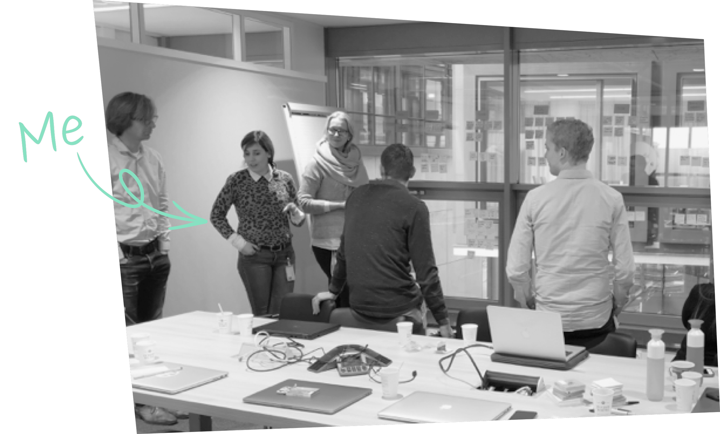
I started as a general UX contributor, but once the concept was established, I took full ownership of the visual design.
I started the project by helping to shape the app’s concept during the ideation phase. As the project moved forward, I shifted my focus to take full ownership of the visual design, which had to reflect the new TomTom brand while staying consistent with other ongoing projects. Once the direction was clear, I built a detailed design library. This included more than just a style guide — I established a new iconography style, defined the map’s color palette, and designed motion for transitions, ensuring a cohesive and polished user experience across all touchpoints.
Concept & ideation phases
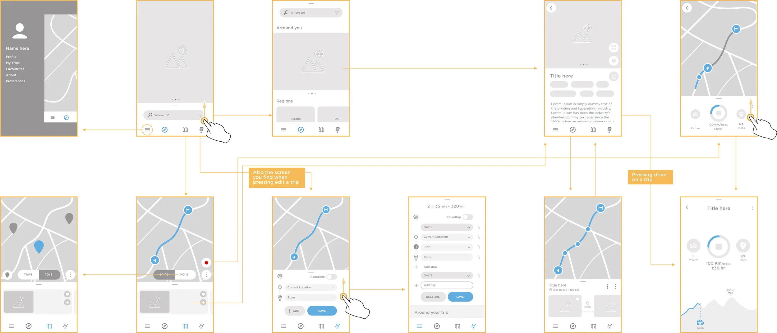
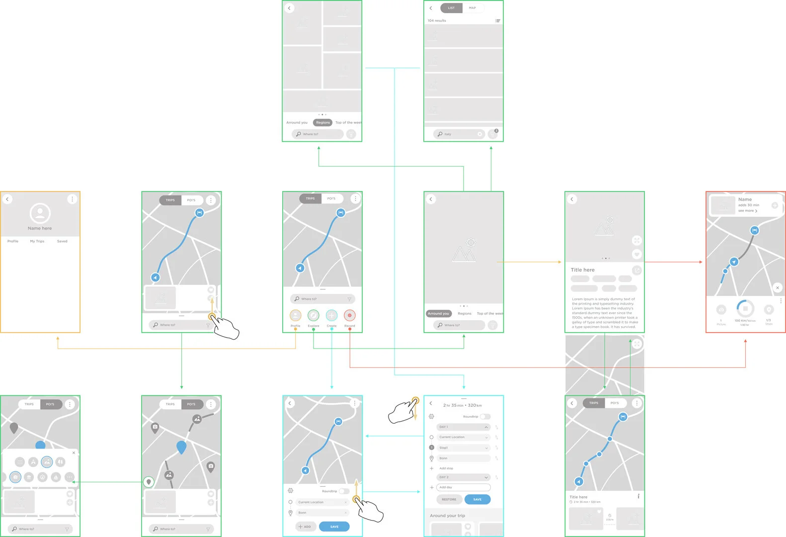
I contributed to creating personas and user journeys, defining the application’s value proposition, and developing two initial UX concepts.
-
Concept more focused on planning, where this app would serve more as a planning tool than a source of inspiration leaving that focus for the web page that would be a companion of the app.
-
The concept focuses on providing effective planning tools while achieving a balance between both perspectives.
Shaping the visual language
As the lead for this app's visual style, I defined design principles, re-styled the map, and created the iconography, ultimately building a comprehensive component library.
As my main responsibility on this project was defining the visual style for this app, I started by defining design principles taking into account the strategic vision and marketing requirements.
For the iconography, I collaborated with a team working on another app, as both needed to feel part of the same family.
Here you see icons that were specific for Roadtrips (RT), designed by me.
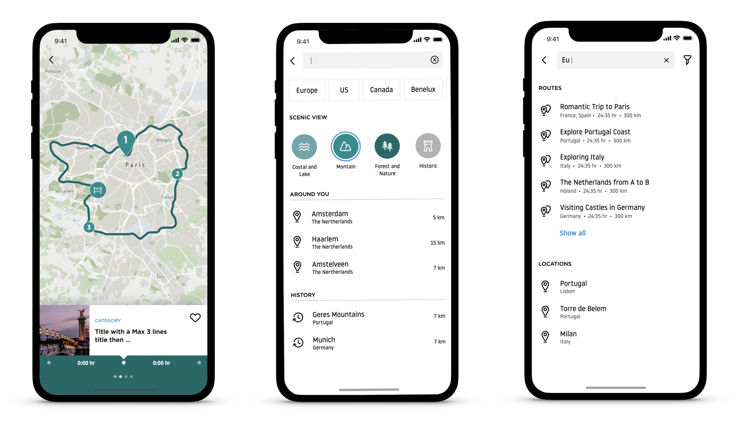
Restyling the Map.
Because I felt the existing map wasn’t visually aligned with the goals for RT, I decided to restyle it.
I proposed a new color scheme that would transpire nature and lifestyle landmarks, and not be so focused on traffic and navigation information.
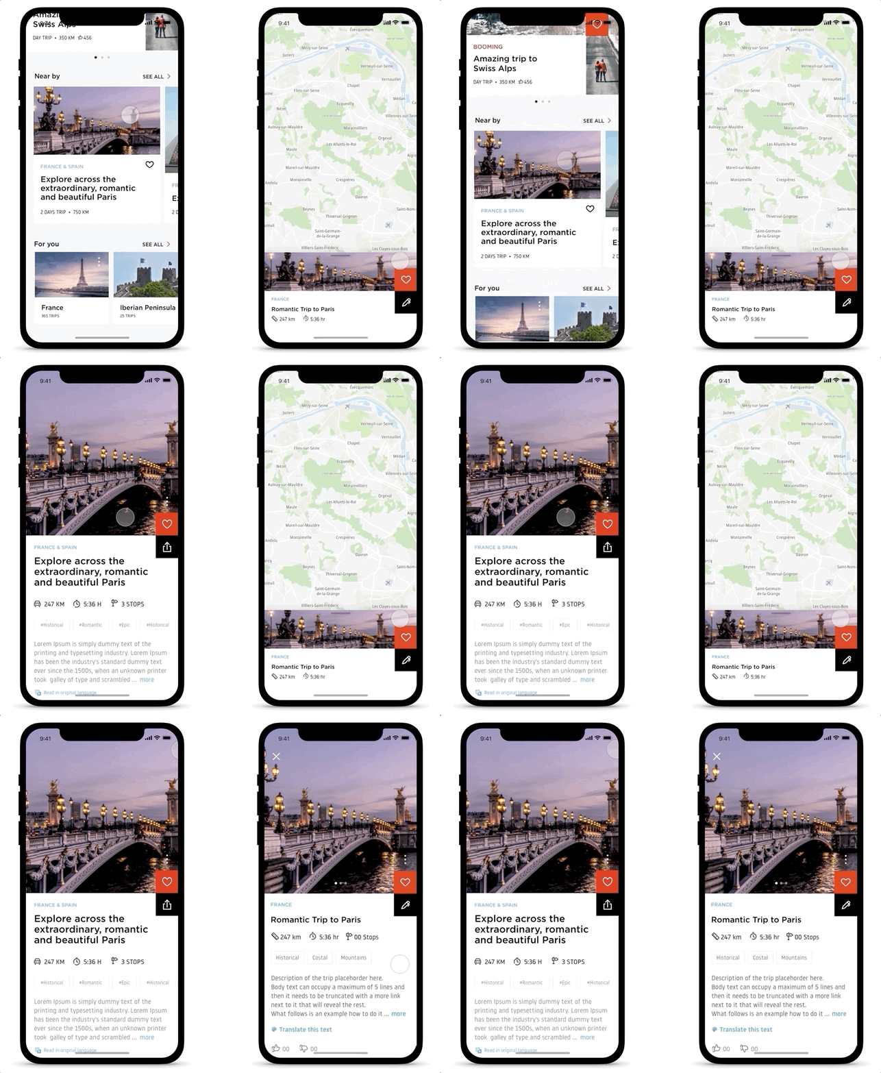
Final result
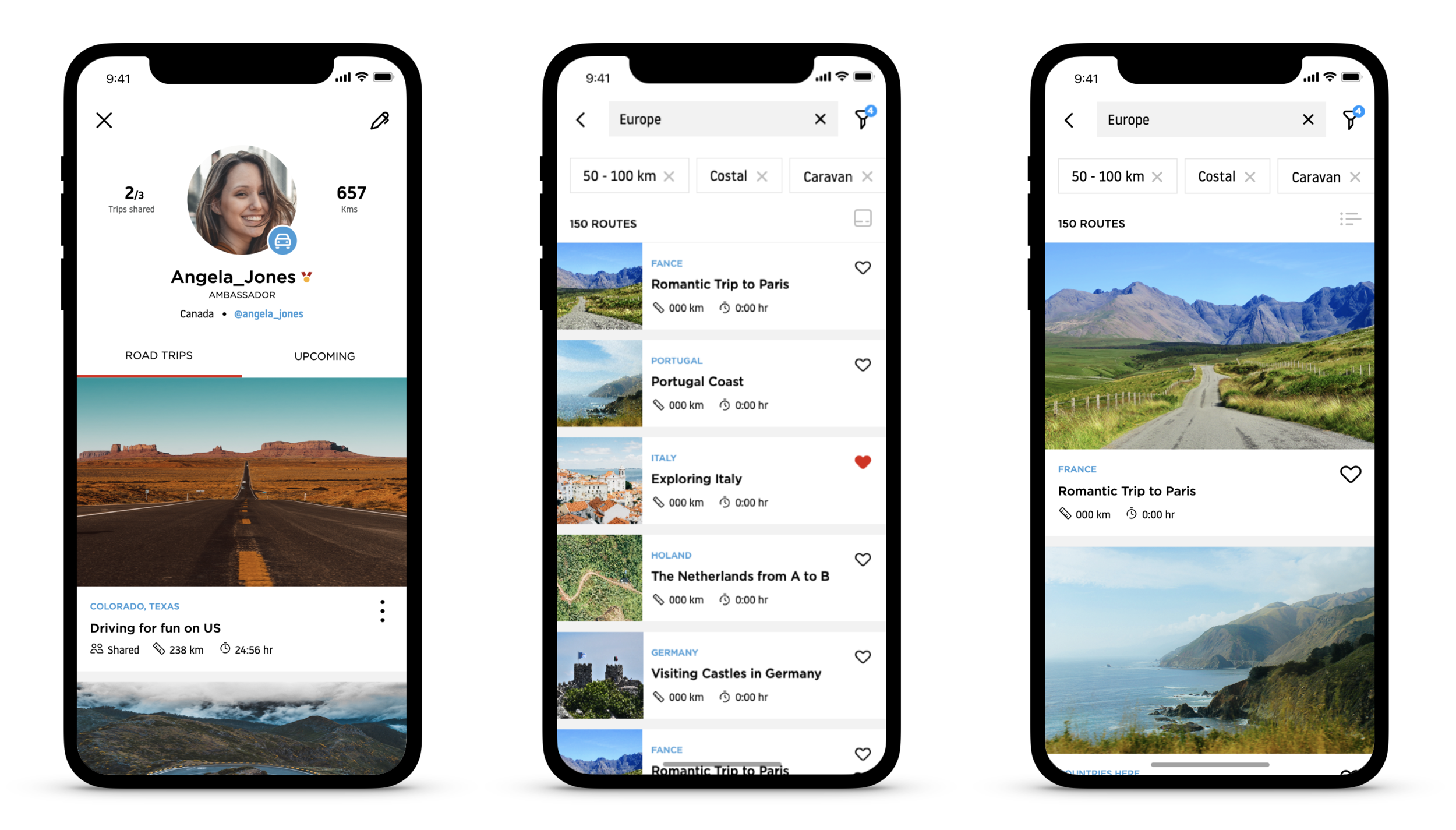
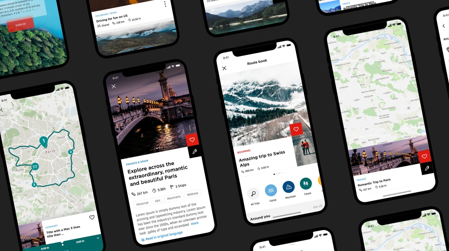
As this was a highly visual app, I decided to enhance the inspirational and immersive feel in some key elements and motion design.
All details mattered to build a user experience of excellence.
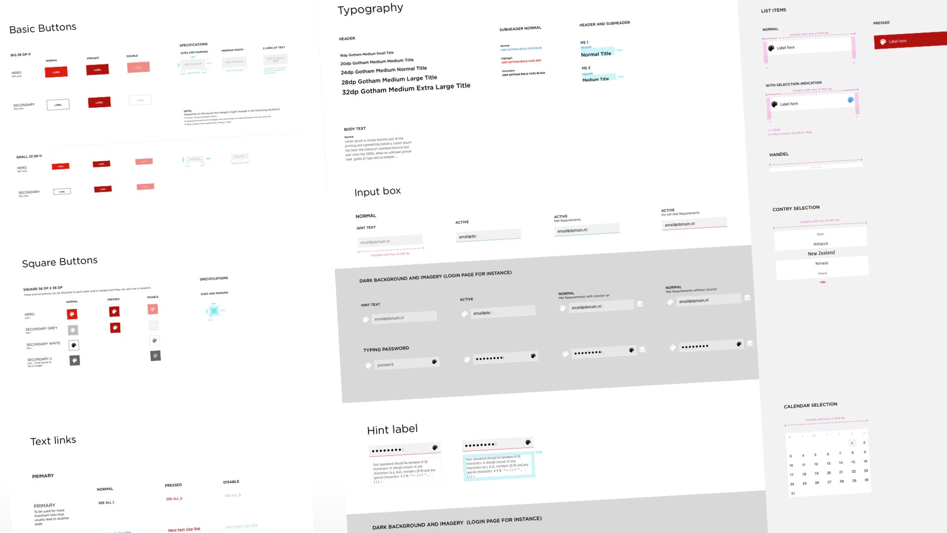
For the visual look, I inspired myself on the concept of ‘unfold pages on a magazine’, for an editorial and inspirational feel. At the same time, the application had to transpire the TomTom brand recently rebranded. I built a library with all components and shared it with the Development team through Zeplin.

