Reimagining TomTom Navigation
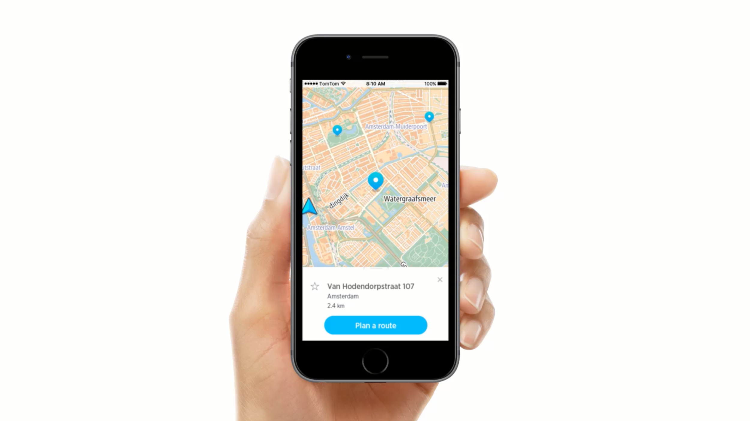
With focus on mobile, we completely reimagined the “TomTom classic” experience. We designed this app entirely from scratch, we improved existing patterns and established new ones for the vast majority of the experience.
My role
My focus on this project was the visual and motion design of the app, in collaboration with another designer.
I was part of a small design team working on a new app meant to showcase TomTom’s latest technology to its clients. The intent was to make this UI a customizable base.
We focused solely on mobile, and the main goal for our team was to push the boundaries of what a TomTom app could look and feel like.
Innovation
What’s Ahead cards
Beyond creating a whole new identity that could be customized, we’ve also invented and patented a new way to interact with driving instructions.
Visual concept
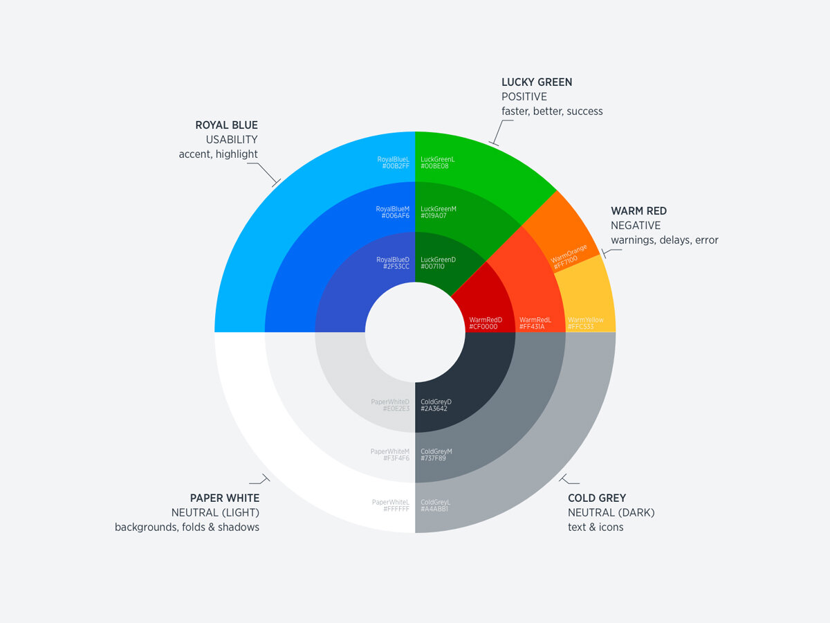
Since the UI was meant to be customizable, we had to keep it fairly simple.
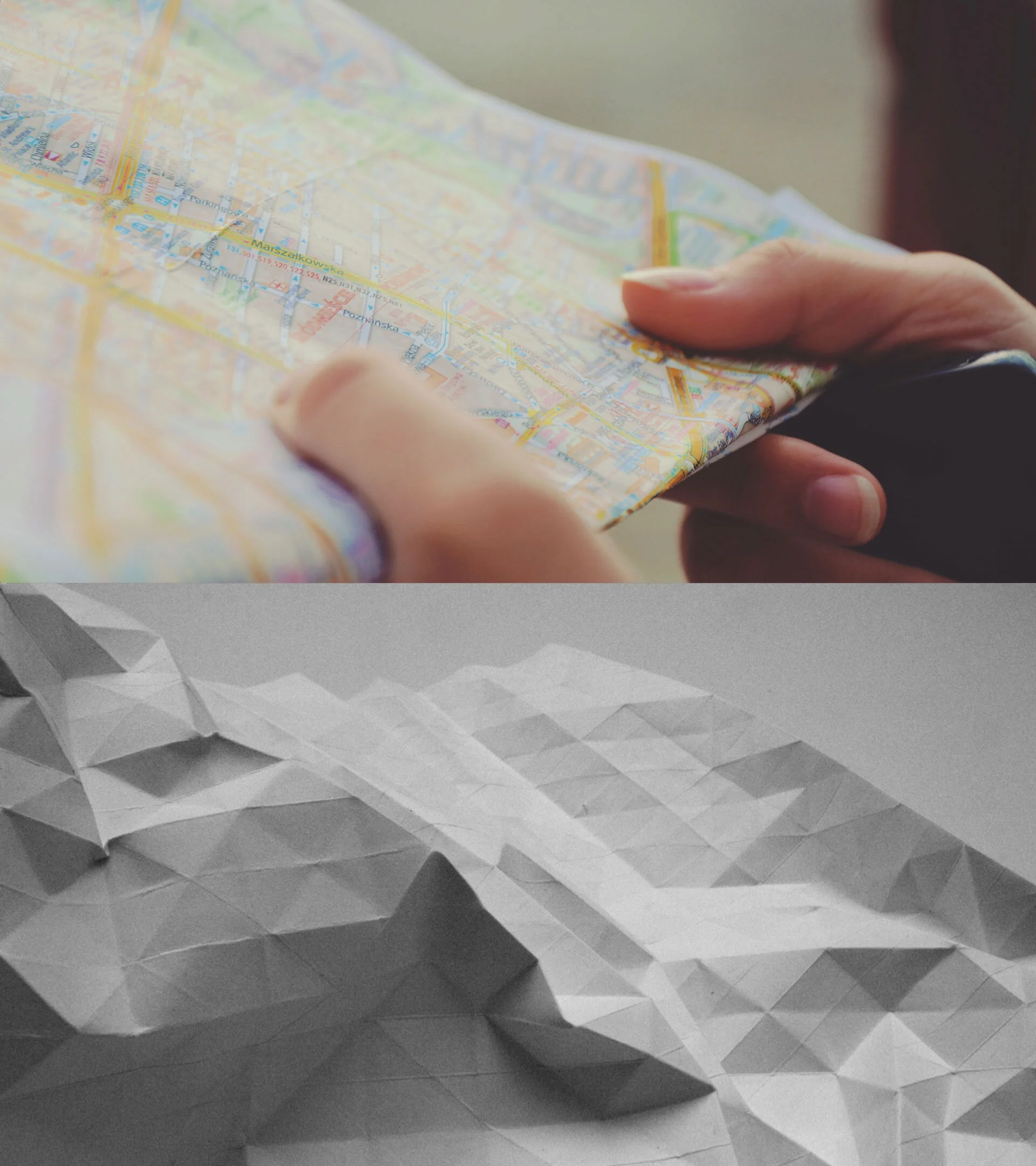
Despite that, we still managed to take some inspiration from real-life foldable maps into some of our color choices, as well as the little triangular shadows we added in some of the UI components, mimicking subtle paper folds.
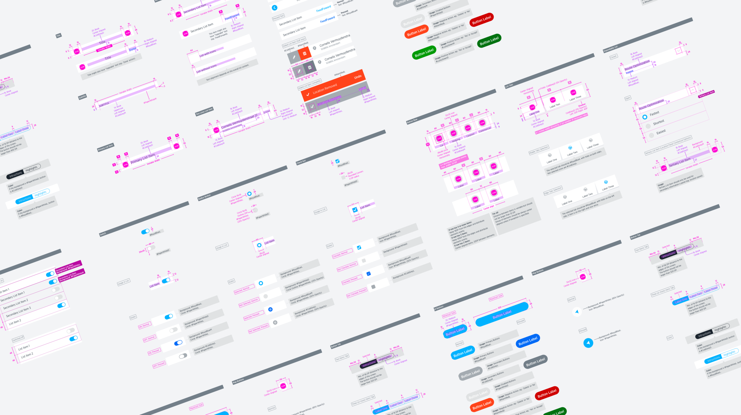
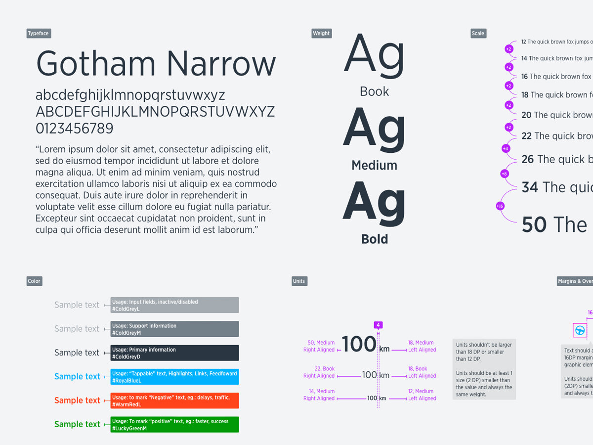
Documentation isn’t sexy, but I made my best effort to make sure it could stand on its own, since our engineering team wasn’t based in Amsterdam.
