Improving mobile navigation
For a period of time I was assigned to improve an existing app, TomTom Go Mobile.
I tackled UX issues in partnership with another designer, being my focus more on the visual side of things.
We made countless small improvements, but here I decided to share just one of them, which consisted in answering the question of ‘How might we soften the punch of a hard paying wall?’.
Challenge
How to soften the punch of a hard paying wall?’
What is the problem?
Business decided to stop the “freemium” model, instead users need to pay before even seeing the app.
Is a problem because …
We need to show the potential of the app without the user actually being able to use it - this with a competitive landscape full of free apps.
If not successful…
If the value of the app is not perceived, users might just give up and delete the app, costing TomTom users, data and money.
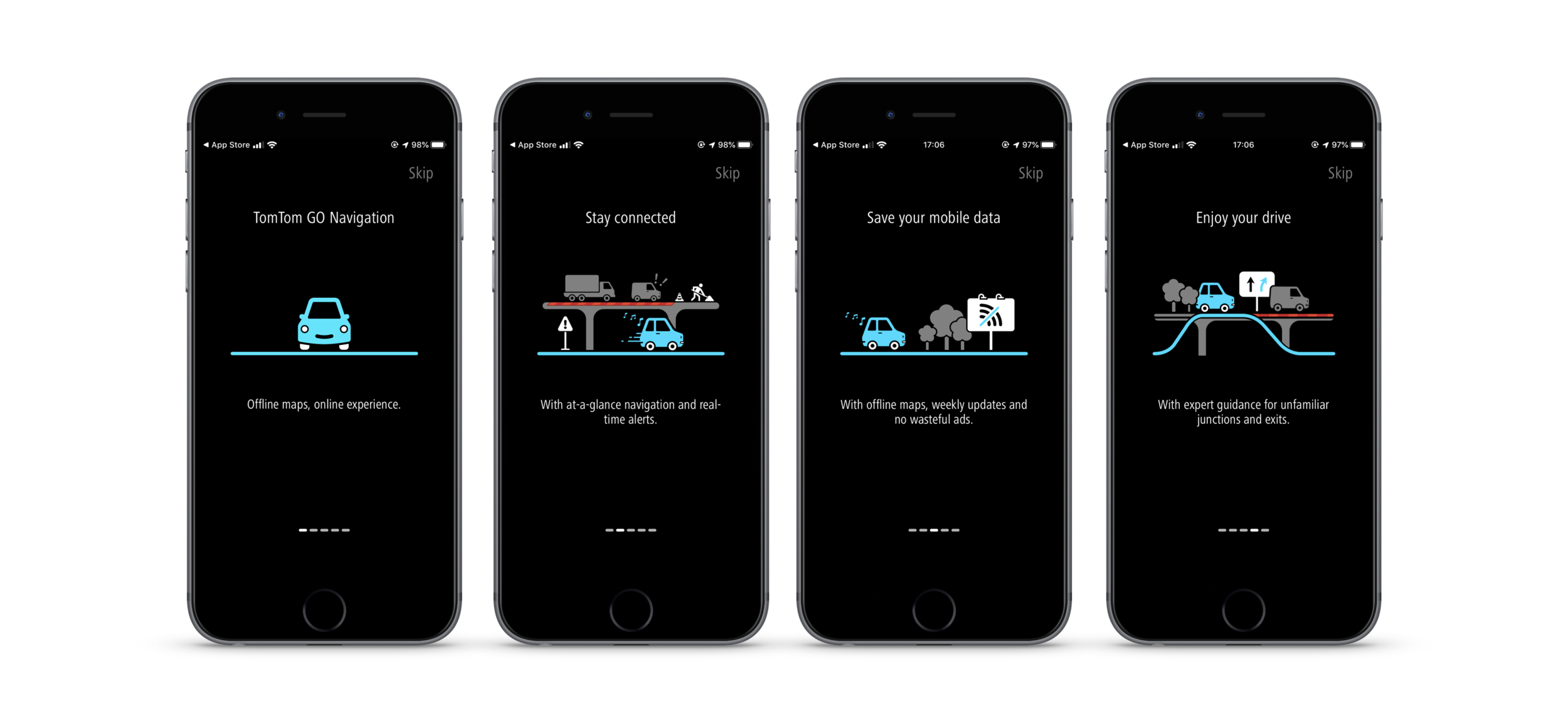
We decided to introduce an on-boarding carrousel, that could soften the punch and explain the main features and value of the app, before displaying the paywall.
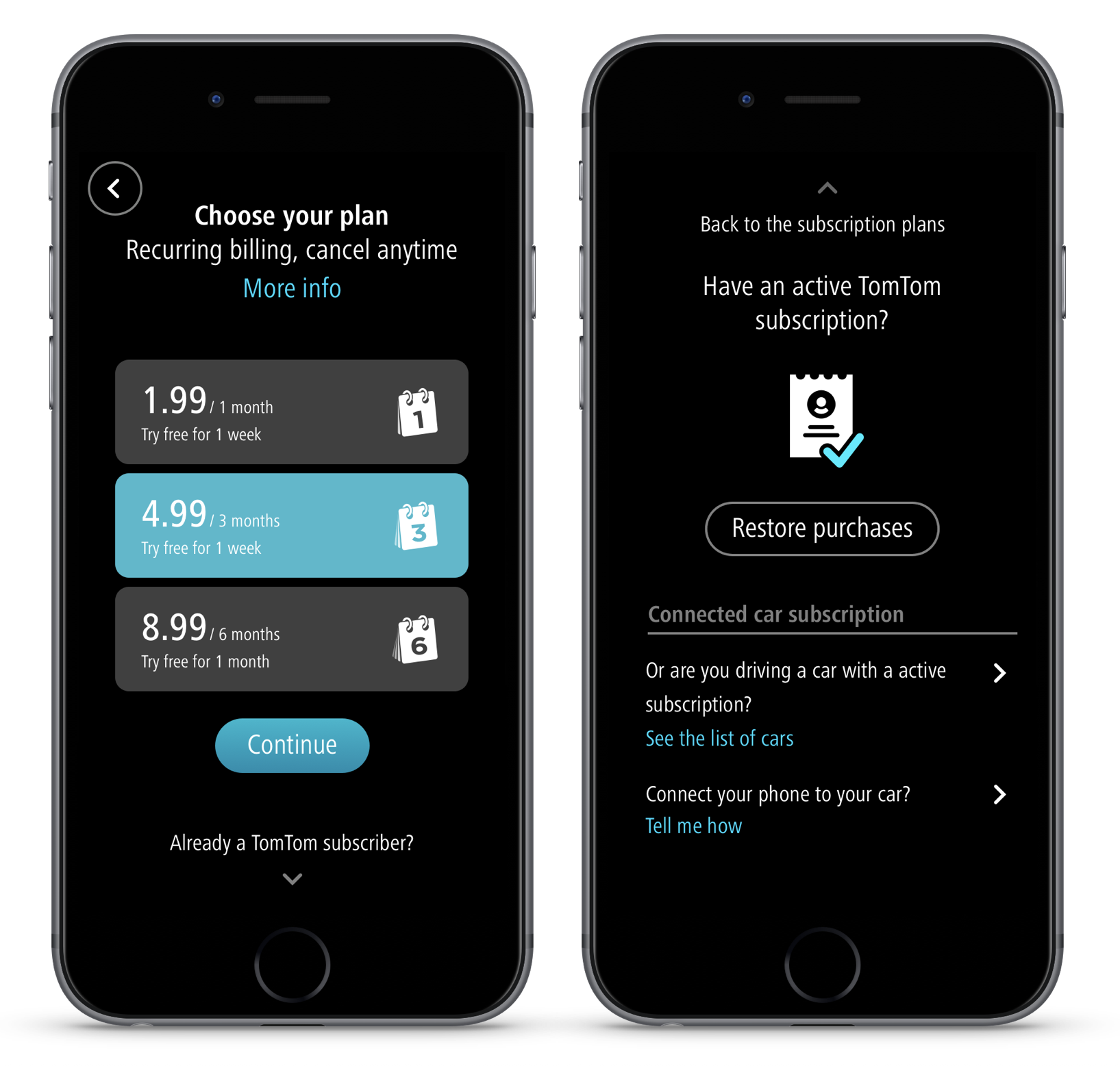
Our first proposals for showing payment options.
Alternative design presented, because the first one was too costly to build.
Result
User tested, iterated based on learnings and launched to the general public.
What was the impact?
Tested in 6 interviews. Users skipped immediately the on-boarding but once they understood they had to pay, they went back and read it carefully.
Users understood the Onboarding and seemed exited with the features. Some further information needed some clarification.
Some of the vocabulary used needed improving.
At launch …
At launch, some users where unhappy to have to pay or in the change of packages.
Other challenges
Challenge
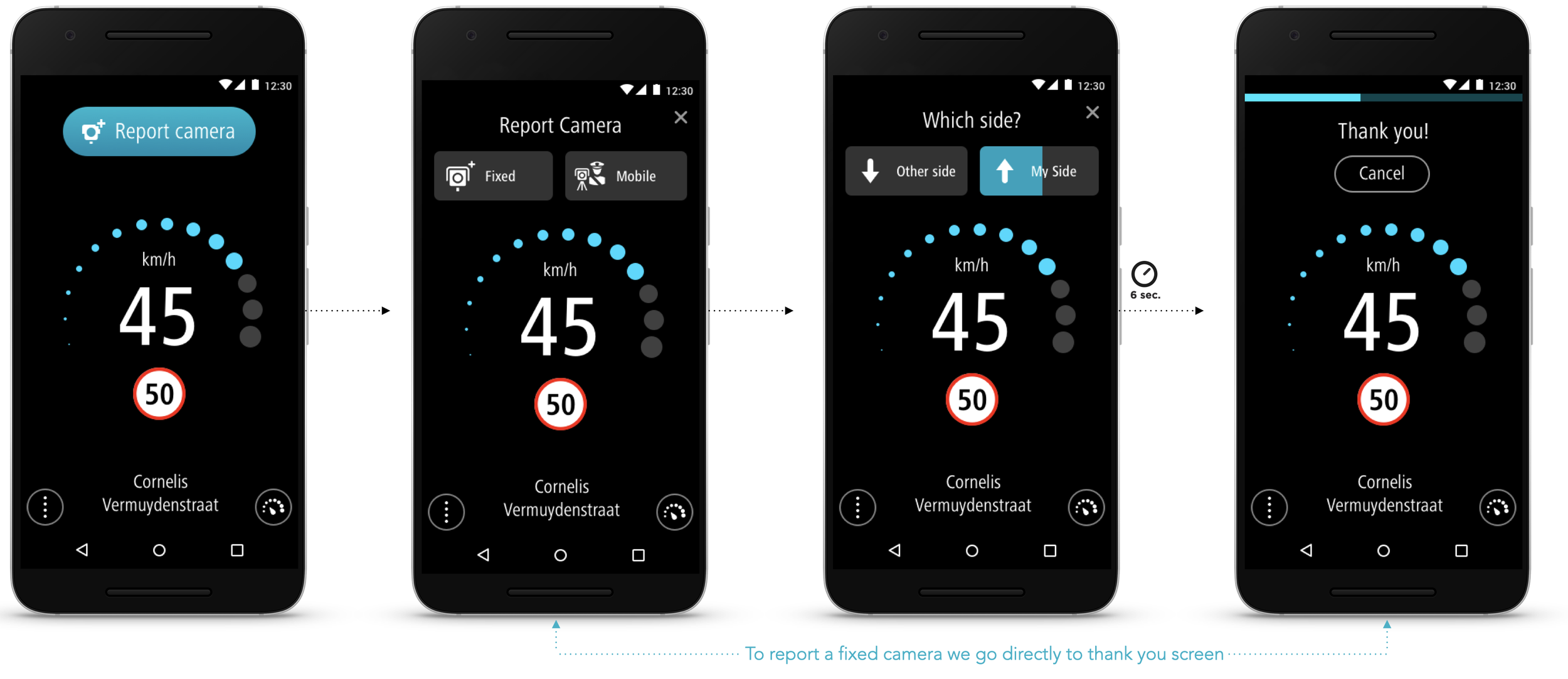
How can the main information on the screen stand out?
The app's main information was originally positioned at the bottom of the screen, leading to an empty display 90% of the time. Users frequently reported difficulty in glancing at the information they needed while driving, compromising safety and risking user retention.
As result…
A design fix was implemented and first released to beta testers.
After successful feedback, the update was rolled out. Users reported increased satisfaction, noting that the information was now clearer and easier to read at a glance. As a result, the app's already strong rating on the Play Store improved further.


